Yet another It sucks post! Yesterday I installed the Apple Safari browser on my Windows Vista machine. I thought that it would be nice to use the fastest web browser in the universe to do some application/site compatibility testing without having to have a Mac OS/X system.
Yes it is a beta, so I won’t complain about all the bugs and rendering problems (it might of course be the sites I’m testing but in some cases I don’t think so) - I will instead complain on the ugly look and appearance of it.
The Window
Safari for Windows is a Windows application created by Apple for the Windows platform and nothing else. So, the window layout should apply to the Windows standards! The brushed metal thingies Apple uses don’t work with me, that’s one of the reasons I always disliked QuickTime. Resizing the window is only allowed in the lower right corner - don’t like it either. Since I’m using Vista Aero it does not look good, no shadow nor transparency! OS/X scroll bars and all other OS/X stuff don’t get me on.
If Safari is to be some kind of success and if Apple is trying a hostile takover of the desktop then make it look and behave like a Windows application.
Font smoothing
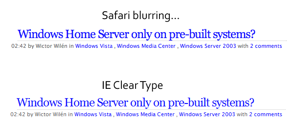
Yes I’ve read Joels post on why Apple and Microsoft uses different methods of displaying fonts on the screen and I understand why. But it does not look pretty - it looks like someone poured water on the screen and let all the liquid crystals float around and get all blurry! I get a headache when reading text in the Safari - it feels like I’m not wearing my glasses!

I just had to get all this off my chest, and I’m not alone having some troubles with Safari.
The future
I think Safari for Windows is here to stay and not just to create another browser war (remember the good old IE and Netscape) but to recruit (read steal) developers for the iPhone scene.
And now we don’t have to get a Mac OS/X license to make website compatibility testing!
