This first real post in the SharePoint 2010 Ribbon Controls series (full series index available here) will be about some of the common properties that most or all of the Ribbon controls shares. I assume that you have some basic knowledge of SharePoint 2010 Ribbon customization, if not check out one of my previous posts.
What is a Ribbon control?
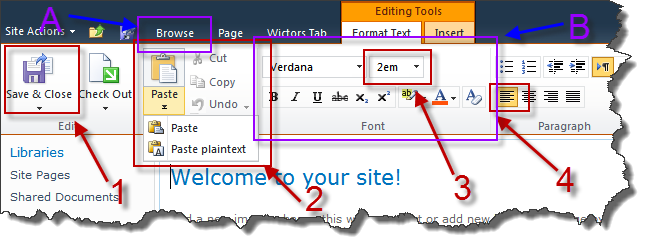
A SharePoint 2010 Ribbon Control is the interactive parts of the Ribbon. Controls exits within a Group (B) within a Tab (A). The controls can be labels, buttons, drop downs, menus, galleries and more. You can add, remove or change default Ribbon controls or add completely new Tabs and Groups.

The default Ribbon interface is defined in CMDUI.xml which is located in the {SharePoint Root}\TEMPLATE\GLOBAL\XML. A good tip is to take a look at the default Ribbon configuration before making your own Tabs and Groups - but never ever change the CMDUI.xml file!
In the image above you see some common controls;
- This is a MRUSplitButton control, which contains a submenu with different items
- This is a SplitButton, also with a submenu
- This is a ComboBox
- This is a ToggleButton
In this series we will take a look at each one of those controls, to be exact I’ll show you all available controls in the Ribbon.
All SharePoint 2010 Ribbon customization is done through XML, there are a couple of ways to add them - statically or dynamically, but the XML are the same. The controls must be children of a Controls element within a CommandUIDefinition, Group or MenuSection element (all defined in the Server Ribbon Schema). Some are are more advanced than others.
Common control properties
All controls have a set of properties that works basically the same. Instead of repeating them for all posts in this series I will walk you through them once and for all before I go in to the specific control properties. Some of these properties will be repeated to discuss specifics for the respectively controls.
Property: Id (required)
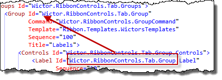
The Id property of a control is one important and sensitive little guy. It’s a string value and must be unique within your Ribbon customization. Not specifying it or not making it unique can make your whole customization fail without any good error messages.
I prefer using a “namespace” style of control Id’s so that I easily can find out where the control belongs. Preferably prepend the control id with the id of the Tab or Group.

Property: Sequence
The Sequence property states in what order the controls should appear in overflow sections. It’s not required but if present it must be an integer.
Property: TemplateAlias
The TemplateAlias property is used to specify which template alias to use from the Group Template Layout. That is how the control is positioned, which section or row. This property must be a string value corresponding to one of the aliases defined in the group template layout.

Important here is to make sure that your control can handle the DisplayMode of the specified TemplateAlias.
NOTE: Make sure that you always create your own Group Templates. Read AC’s post about it here: http://www.andrewconnell.com/blog/archive/2010/10/10/always-create-your-own-group-templates-with-sharepoint-ribbon-customizations.aspx
Property: ImageXXbyXX, ImageXXbyXXTop, ImageXXbyXXLeft, ImageXXbyXXClass
These properties are used to specify an image/icon for a control, it is not used by all control types but you can expect them to be used on Labels and Buttons. Different controls use different sizes (the XX’s in the header) - it’s either 16x16 or 32x32. Which one used is defined by the DisplayMode of the template alias. The ImageXXbyXX specifies a URL to an image. ImageXXbyXXTop and ImageXXbyXXLeft is used when you use CSS sprites to select the position of the icon from the composite image (example below). The ImageXXbyXXClass is used to set a specific CSS class to the control - for instance if you prefer to use CSS to create the image layout.

Property: Command
All controls have a Command property which specifies the command to run when for instance a button is pressed. This is a string defining the command. If you use declarative commands, that is defined in the XML using CommandUIHandler elements, then the CommandUIHandler with the corresponding Command attribute will be invoked. If you instead use page components then Command value is handled by the handleCommand JavaScript function of the page component. I will show you more about this in upcoming samples.
Property: QueryCommand
The QueryCommand works just the same as the Command property with the difference that it is invoked when the Tab is getting focus. The function is also invoked directly after the Command command. You can use this one to set values of the controls.
Summary
So now we’ve started this series for real. Keep on reading, next post will come shortly, and that one is about the Label control.
