Welcome back to another post in the SharePoint 2010 Ribbon Controls series (full series index available here). Now it is time to introduce the TextBox control, which can be used to allow users to enter text information in your Ribbon customzations.
What is the TextBox control?
If you’re familiar with .NET development (WinForms or ASP.NET) then you already know what a TextBox is. It allows your users to enter and change text.

TextBoxes are often accompanied by Label controls which have the ForId set to the Id of the TextBox to enhance the user interface.
Sample TextBox control
A TextBox could be defined in XML like this:
TextBox Id="Wictor.RibbonControls.Tab.TextBox"
    Command="Wictor.RibbonControls.TextBoxCommand"
    QueryCommand="Wictor.RibbonControls.QueryTextBoxCommand"
    TemplateAlias="section2"
    Width="100"
    MaxLength="20"
    Sequence="10"
    ToolTipImage32by32="/_layouts/Images/Wictor.RibbonControls/Wictor.RibbonControls.png"
    ToolTipImage32by32Left="0"
    ToolTipImage32by32Top="-48"
    ToolTipImage32by32Class="TextBoxTTClass"
    ToolTipDescription="A box where you can enter text"
    ToolTipHelpKeyWord="RibbonControls"
    ToolTipShortcutKey="J"
    ToolTipTitle="This is a textbox"
    ShowAsLabel="false"
    ImeEnabled="true"
    />
TextBox control properties
Part from the common properties such as Id and Sequence the following properties can be set:
Property TemplateAlias
As for most of the controls you have to know which DisplayModes a control can use. The TemplateAlias for the TextBox must be connected to a Layout row/section with a DisplayMode that has the Medium value.
Property Width
The Width property does exactly what it says - it sets the width of the TextBox (in pixels).
Property MaxLength
The MaxLength property sets the maximum number of characters allowed in the TextBox.
Property ShowAsLabel
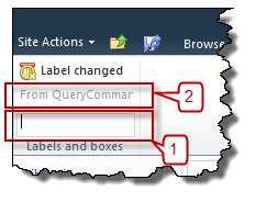
ShowAsLabel is a boolean that controls if the TextBox should be rendered as a text box or just a Label. In the image above #1 is a standard TexBox but #2 is a TextBox with ShowAsLabel set to true. Kinda weird - you could use a Label control instead.
Property ImeEnabled
If the ImeEnabled is set to true then the Input Method Editor (IME) is set to an active state. Useful when working with Asian languages.
Property QueryCommand
The QueryCommand is invoked when Tab is getting focus or after a Command command. It is normally used to set the default value of the TextBox. You also need to use the QueryCommand to set the value in the text box if the ShowAsLabel property is set to true. This is how to set it using the handleCommand Page Component method:
handleCommand: function (commandId, properties, sequence) {
    switch (commandId) {
        case 'Wictor.RibbonControls.QueryTextBoxCommand':
            if(null == properties['Value']) properties['Value'] = 'Default value';
            return;
    }
}
Property Command
The Command is invoked when the control looses focus (such as selecting another control or pressing a button). You can use this to do calculations or directly store values. Directly after the Command invocation the QueryCommand is invoked. Here is a snippet that converts the value of a text box to upper case:
handleCommand: function (commandId, properties, sequence) {
    switch (commandId) {
        case 'Wictor.RibbonControls.TextBoxCommand':
            properties['Value'] = properties['Value'].toUpperCase();
            return;
    }
}
Property ToolTipTitle
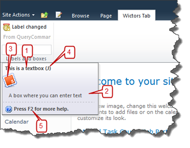
The ToolTipTitle contains a string value for the tooltip of the TextBox. The image below show how tooltips looks like in the Ribbon. The ToolTipTitle is #1.

Property ToolTipDescription
The ToolTipDescription represents the description of the tooltip. It’s #2 in the image above.
Property ToolTipImage32by32, ToolTipImage32by32Left, ToolTipImage32by32Top, ToolTipImage32by32Class
These properties represents the icon shown in the tooltip (#3 in the image above). It must be a 32x32 pixel icon and works as icons previously described in the series.
Property ToolTipShortcutKey
The ToolTipShortcutKey (#4) represents the character/key for keyboard shortcuts.
Property ToolTipHelpKeyword
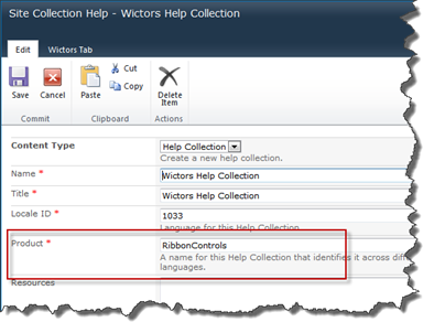
If you need to include help for your TextBox that takes more than a title or description, then you can use the built-in context sensitive help in SharePoint, which is a really cool feature, see #5 in the image above. Read more about how to configure context sensitive or custom help collections in SharePoint 2010 in the Customizing SharePoint 2010 Help post by the Microsoft SharePoint End-User Content Team. The value in this property must correspond to the Product property of the Help Collection in the custom help.
Summary
Using TextBox controls allows you to easily allow users to write input text in your Ribbon customizations; for example in a contextual aware Web Part Ribbon customization. In the next post I’ll show you the Button control
