Now it’s time for the SharePoint 2010 Ribbon Button Control in the Ribbon Control series (full series index can be found here),
What is the Button control?
The Button control needs no further description - it’s a button on which the users can click to execute commands. Buttons can exist alone or in menus (which will be covered later in the series).

Sample Button control
A Button control could be implemented as follows:
Button Id="Wictor.RibbonControls.Tab.Button1"
        TemplateAlias="section1"
        Alt="Alt Button text"
        Command="Wictor.RibbonControls.ButtonCommand"
        CommandType="General"
        LabelText="The Button"
        Sequence="10"
        Image16by16="/_layouts/Images/Wictor.RibbonControls/Wictor.RibbonControls.png"
        Image16by16Left="0"
        Image16by16Top="-32"
        Image16by16Class="ButtonClass16"
        Image32by32="/_layouts/Images/Wictor.RibbonControls/Wictor.RibbonControls.png"
        Image32by32Left="0"
        Image32by32Top="0"
        Image32by32Class="ButtonClass32"
        LabelCss="BtnLabelClass"
        ToolTipImage32by32="/_layouts/Images/Wictor.RibbonControls/Wictor.RibbonControls.png"
        ToolTipImage32by32Left="0"
        ToolTipImage32by32Top="0"
        ToolTipImage32by32Class="ButtonTTClass"
        ToolTipDescription="A nice and shiny button"
        ToolTipHelpKeyWord="RibbonControls"
        ToolTipShortcutKey="ALT + B"
        ToolTipTitle="This is a Button"
        />
Button control properties
As you can see from the code sample above the Button control allows for more customizations than the previous discussed controls.
Property TemplateAlias
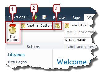
As always with the Ribbon controls you have to make sure that you use a Group Template Layout with a DisplayMode that fits the control. The Button can have the Large, Medium and Small display modes, shown in the figure above as #1, #2 and #3 respectively. When a Button is used in menus, discussed later on in the series, more display modes can be used.
Property LabelText
This is the label of the Button and is shown in Large and Medium display modes.
Property LabelCss
Specifies a CSS selector class for the label of the Button control
Property Alt
Alternative text for the button.
Property Image16by16????
Used for Medium and Small display modes. See post about common control properties for more information.
Property Image32by32????
Used for the Large display mode. See post about common control properties for more information.
Property ToolTip????
See the TextBox control post for more information about tool tips.
Property Command
The Command specifies the command executed when the Button is clicked. You can use it as follows in the Page Component handleCommand method:
handleCommand: function (commandId, properties, sequence) {
    switch (commandId) {
        case 'Wictor.RibbonControls.ButtonCommand':
            alert('Button: ' + properties['SourceControlId']);
            // Do some funky stuff here...
            return;
    }
}
The properties object contains three properties:
- SourceControlId - The Id of the Button control clicked (good if you use the same command for several buttons)
- MenuItemId - The MenuItemId (only used in Menus, see below)
- CommandValue - The CommandValueId (only used in Menus, see below)
Property Description
This Description property is only used when the button is present in a menu and not in stand alone mode. The display mode must be set to Menu32 to show the Description.
Property CommandType
The CommandType can have the following values:
- General - default value, if attribute is omitted - plain ol’ button
- OptionSelection - used in menus to create selectable options (now you’re curious - but I’ve said menus later…)
- IgnoredByMenu - also used in menus, a click on these does not close the menu
Properties MenuItemId, CommandValueId
A string identifier and a string command value only used in menus
Summary
That’s all about Buttons - not that advanced but as you see they get more interesting in menus. Next post coming soon to a blog reader near you will be CheckBox control.
