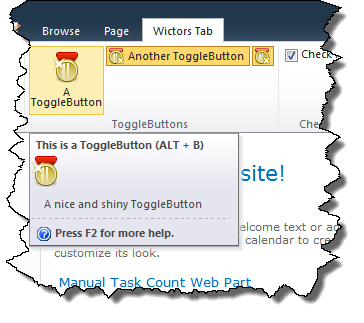
Back with another SharePoint 2010 Server Ribbon Controls post, this time a shorter one, compared to previous posts. We’ll take a look at the ToggleButton control.
I know I said I’m going to talk about the DropDown in this post, but I’d reconsidered and take the easy ones first - since the DropDown control will be divided into several posts.
What is a ToggleButton control?
The ToggleButton control is very similar in behavior to the Button control with the difference that you can toggle the state of the button; it can either be on or off.

When the ToggleButton has the On state it has an alternate background color.
Sample ToggleButton control
This is how a ToggleButton can be implemented in a CustomAction:
ToggleButton Id="Wictor.RibbonControls.Tab.ToggleButton1"
    TemplateAlias="section1"
    Alt="Alt Button text"
    Command="Wictor.RibbonControls.ToggleButtonCommand"
    QueryCommand="Wictor.RibbonControls.ToggleButtonQueryCommand"
    Description="Description"
    LabelText="A ToggleButton"
    Sequence="10"
    Image16by16="/_layouts/Images/Wictor.RibbonControls/Wictor.RibbonControls.png"
    Image16by16Left="0"
    Image16by16Top="-32"
    Image16by16Class="ButtonClass16"
    Image32by32="/_layouts/Images/Wictor.RibbonControls/Wictor.RibbonControls.png"
    Image32by32Left="0"
    Image32by32Top="0"
    Image32by32Class="ButtonClass32"
    LabelCss="BtnLabelClass"
    ToolTipImage32by32="/_layouts/Images/Wictor.RibbonControls/Wictor.RibbonControls.png"
    ToolTipImage32by32Left="0"
    ToolTipImage32by32Top="0"
    ToolTipImage32by32Class="ButtonTTClass"
    ToolTipDescription="A nice and shiny ToggleButton"
    ToolTipHelpKeyWord="RibbonControls"
    ToolTipShortcutKey="ALT + B"
    ToolTipTitle="This is a ToggleButton"
    />
ToggleButton control properties
The ToggleButton is very similar to the Button control and also the properties are the same, so before proceeding read about the Button control. The properties documented below are only the ones differing from the Button control or not available for the Button control. The only property from the Button control that is not available in the Button control is the CommandType.
Property Command
Just as for a Button control the Command command is executed when someone clicks the ToggleButton. In the JavaScript method that handles the command the state (On or Off) can be retrieved for the ToggleButton. You check the value of the ToggleButton like this in a JavaScript Page Component:
handleCommand: function (commandId, properties, sequence) {
    switch (commandId) {
        case 'Wictor.RibbonControls.ToggleButtonCommand':
            if(properties.On == true) {
                alert('ToggleButton state is On');
            }
            else {
                alert('ToggleButton state is Off')
            }
            return true;
    }
}
Property QueryCommand
The QueryCommand is invoked when the Tab is loaded and you can use it to set the initial state of the ToggleButton like this:
handleCommand: function (commandId, properties, sequence) {
    switch (commandId) {
        case 'Wictor.RibbonControls.ToggleButtonQueryCommand':
            // set initial state to on
            properties.On = true;
            return true;
    }
}
Summary
The ToggleButton is as you’ve seen very similar to the Ribbon control and it is a great alternative to the CheckBox control when you need to handle on/off states. Before diving into the advanced (menu) controls we’ll take a look at the Spinner control in the next part.
