Welcome back to part 6 of my SharePoint 2010 Ribbon Controls series (full series index can be found here). This time we’ll take a look at the CheckBox control.
What is the CheckBox control?
If you’ve not been hiding under a rock you should now what a CheckBox is - it’s a box you can check. It can have two states - checked or not checked.

Sample CheckBox control
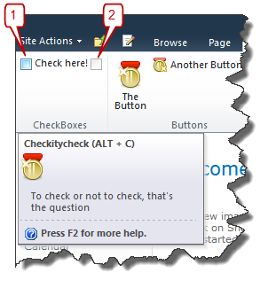
A CheckBox can look like this when implemented in the Ribbon:
CheckBox Id="Wictor.RibbonControls.CheckBoxes.CheckBox1"
    LabelText="Check here!"     Command="Wictor.RibbonControls.CheckBoxCommand"
    QueryCommand="Wictor.RibbonControls.CheckBoxQueryCommand"
    Sequence="10"
    TemplateAlias="section2"
    ToolTipDescription="To check or not to check, that's the question"
    ToolTipImage32by32="/_layouts/Images/Wictor.RibbonControls/Wictor.RibbonControls.png"
    ToolTipImage32by32Left="0"
    ToolTipImage32by32Top="0"
    ToolTipImage32by32Class="CBTTClass"
    ToolTipHelpKeyWord="RibbonControls"
    ToolTipShortcutKey="ALT + C"
    ToolTipTitle="Checkitycheck"/>
CheckBox control properties
The CheckBox is not that different than the previous controls I’ve shown you.
Property TemplateAlias
As earlier articles shown you it’s important to specify a group template layout with a matching display mode for the TemplateAlias. A CheckBox can have DisplayModes set to only Medium or Small. Medium will show the CheckBox including the label (#1 in the image above) and small will only show the CheckBox with the label as tooltip (#2).
Property LabelText
This is the label of the CheckBox and written next to the CheckBox when Medium display mode is used.
Property Alt
Should be alternative text (never seen this one work though, and not found any trace of it in the generated source code…)
Property ToolTip????
See the TextBox control post for more information about tool tips.
Property MenuItemId
Used in menus (coming in later posts).
Property Command
As usual the Command indicates which command to run when any action is performed on the control - in this case when the CheckBox is clicked. To check if the CheckBox is checked you access the properties.On object which is a boolean (true for checked).
Property QueryCommand
The QueryCommand is executed when the tab is selected the first time and it is also fired directly after the Command command. You can use this to set the default value of the CheckBox using the properties.On object.
A sample implementation of Command and QueryCommand could look like this in a Page Component:
handleCommand: function (commandId, properties, sequence) {
    switch (commandId) {
        case 'Wictor.RibbonControls.CheckBoxCommand':
            if (properties.On) {
                alert('Check!');
            }
            break;
        case 'Wictor.RibbonControls.CheckBoxQueryCommand':
            if (!this.checkBoxDefaultSet) {
                properties.On = true;
                this.checkBoxDefaultSet = true;
            }
            break;
    }
},
checkBoxDefaultSet: false,
In this sample the QueryCommand uses a local (to the page component instance) variable to check if it is the first QueryCommand that is invoked, and not a QueryCommand succeeding a Command command. It always check the CheckBox when the tab is loaded. When a user checks the CheckBox an alert will be shown.
Summary
The CheckBox is a simple yet useful control when building Ribbon customizations. A similar control is the ToggleButton control, which will be discussed in later posts. Next post will be about the DropDown control. Until next time…
