
I spend a lot of time using mainly two applications; Microsoft Visual Studio (2003 and 2005) and Microsoft Office (2007). Microsoft Office 2007 introduces a new user interface that simplifies the usage a lot.
I am a devoted reader to Jensen Harris Office User Interface blog and it has taught me a lot and given me influences on how user interfaces should be built and I try to take his advices in account.
Normally I would never design a user interface except administration interfaces since I am to technical and I personally believe that it should be done by experts…
Visual Studio vs Office
When it comes to how the interface should be designed for usability I think heavily depends on the application but that should only be parameters for the rules of interface design. If you compare Visual Studio and Word - two really different applications but in both you, most of the time, write a lot of text/code. In Visual Studio you use a lot of tool windows and in Office the task panes becomes more and more useful (I really hated them in the beginning). So the basics are pretty common.
Office 2007 is a revolution in interface design
- The adaptive Ribbon works really smooth.
- The Mini Toolbar
- The Quick Access - fast acess to your
I really these three would fit just perfect into the next big upgrade of Visual Studio, and I’m not alone, it will not be in Visual Studio 2007 (Orcas) but I wish and hope for the next version, perhaps 2009?
Yes, I know that a lot of programmers use keyboard shortcuts instead of a mouse and would not gain as much of this as others, but to my experience (did a fast check at work) about 50% of the developers use the mouse to build a solution or project.
Perfect for the Ribbon…
I think Visual Studio, now with all the different designers, and even the possibility to create your own designers, would gain a lot from getting a the Ribbon.
Aaron Brethorst, Program Manager at Microsoft, has his thoughts on the Ribbon in Visual Studio, in the post Sprinkle on a Little Ribbon and You’re Good to…Oh Wait. I might agree with him that it would not be that easy to get it into Visual Studio. There might be something in between of the myriads of toolbars in todays Visual Studio and the Ribbon.
Refactoring should gain a lot from having a Mini Toolbar. Just select the code with mouse and have a Mini Toolbar pop-up with refactoring functions, comment out possibility, create a region and others.
An example of bad design in Visual Studio
Here is an example of bad design in Visual Studio when you use the mouse. Let’s say that you are writing code and would like to create a new function.

When you have written the code a small box appears under the first character of the function and you have to hover the mouse to that position and then you will get a small box in which you can click.

When hovering this box it will expand with a drop down arrow.

Then clicking it will give you a number of choices.
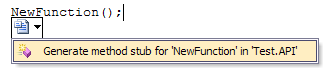
In this case the possibility to generate the stub I wanted.
Would’nt a Mini Toolbar be prefferred here? I gues that Fitt’s Law was not used when this interface feature was designed. Jensen Harris: run on over to the building where the Visual Studio interface team members are sitting and give them a few lessons in user interface design.