Lot of web sites uses a login page so you can identify yourself and so that the application can target information for you. I use a lot of different sites and does a lot of logins and I must say most of these login pages are not user friendly.
 A login page normally consists of two input fields, for username and password, and a button to make the actual login. In most cases there are a checkbox which you can check to make the application remember your login, by using a permanent cookie. The normal pattern, for us keyboard users are to write in username, hit tab, enter password, hit tab, use space button to check the Remember me checkbox, then enter or tab/space to do the login. This sequence is hardcoded into my brain and I really hate those sites that do not use this pattern.
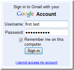
Take a look at the Gmail login page, to the right, which uses this pattern and works like a charm.
But, here are some bad ones:
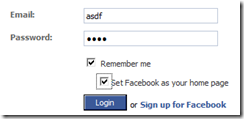
Facebook uses almost the correct pattern, but you cant hit tab/space to login, since when you check the Remember me checkbox, another checkbox pops up. Works fine if you hit enter though.
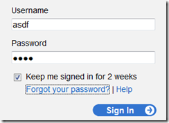
Delicious also breaks the tab/space pattern with a number of links between the checkbox and the sign in button.
These small things gets me really annoyed. There are certainly even more worse examples of bad login pages, but these are sites/services that get a lot of logins. I only highlighted the usability when using keyboard here and did not mention bad security implementations of these login pages, such as the Feedburner login page which tells you if it was the username or password that was invalid…
Do you agree with me?


