
I have for a while thought about why are there no standard in Microsoft applications on how a MDI interface should look like, why do the document tabs look different in (almost) all applications.
Examples
Below are some examples taken from recent Microsoft applications.
Microsoft Visual Studio 2005

Nice and clean layout, the cross to the right closes the current open document. The down-arrow displays a drop-down of all open documents.
Microsoft SQL Server Management Studio

The same as above (screenshot from Microsoft Windows 2003 instead of Microsoft Vista). The down-arrow has a horizontal bar indicating that there are more documents open than tabs shown, which I never reflected over before I started writing this article.
Microsoft Office SharePoint Designer

This one is all different with left and right arrows to scroll between the open documents.
Microsoft Internet Explorer 7
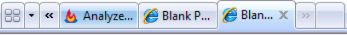
Internet Explorer 7 tabs. Scroll left and right using the double-arrow-tabs and close the tabs by clicking on the cross in the right-side of the tab.
Classic Tab Control

The classic Tab Control, seen in lot of applications.
Microsoft OneNote 2007

OneNote uses their own tabbing design, in this case I think it’s legal due to the kind of application.
How it should be!
I think it’s really strange that the different product teams create their own MDI/tabbing interfaces, and none of the above is ultimate. There are several things that could be improved in the tab interfaces which could lead to better usability and recognition between applications.
This is how I think it could be improved:
- The left and right arrows used in the SharePoint Designer example above is great, they are close to eachother which reduces the mouse movements, combine them with the down arrow to be able to quick navigate to documents.
- The cross icon to close the tab, located on the tab as in the Internet Explorer sample, is great. But all tabs should have one, so you don’t have to click twice; first to select the document and then close it. You have to sacrifice some text for this, but I think it’s worth it.
What do you think and do you have any suggestions for improvements? I would love to hear why the different product teams at Microsoft choosen different alternatives to the tabs.